Turek Store Mariahilferstraßee
The colour blue defines identity, unites all the elements of the shop and is also a perfect background for the products. To display the products the “laying instead of hanging” principle has been introduced. The floor, the presen- tation tables and all the other furniture except the cash desk become a unity in design and colour.
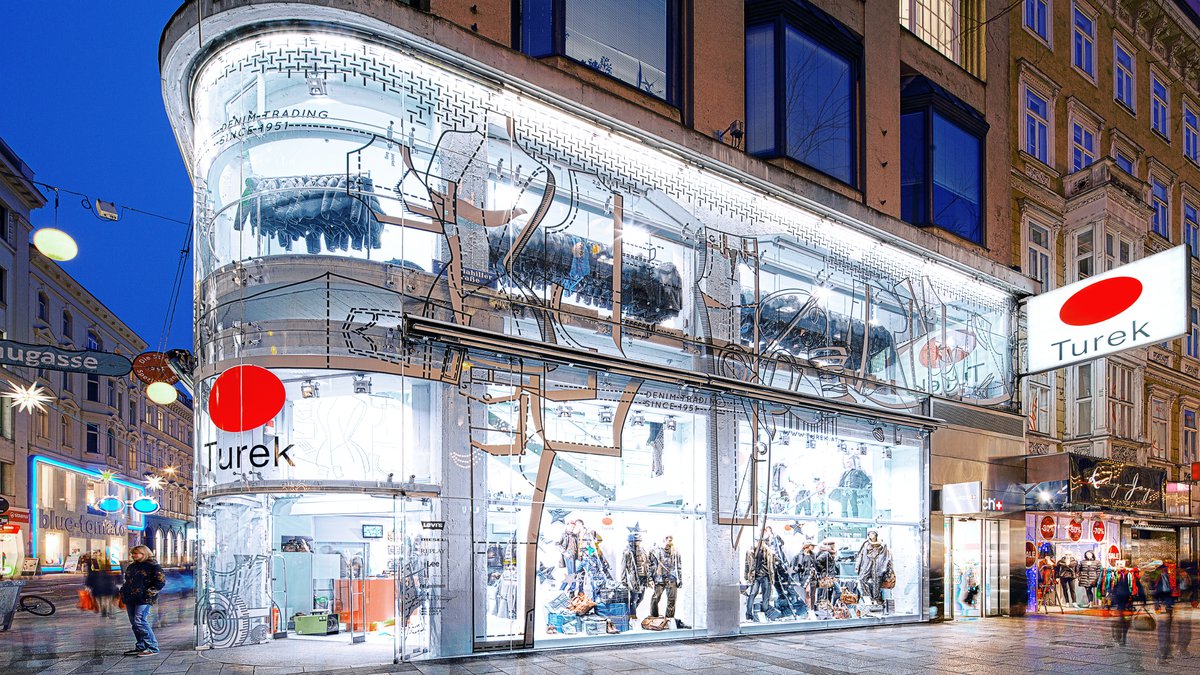
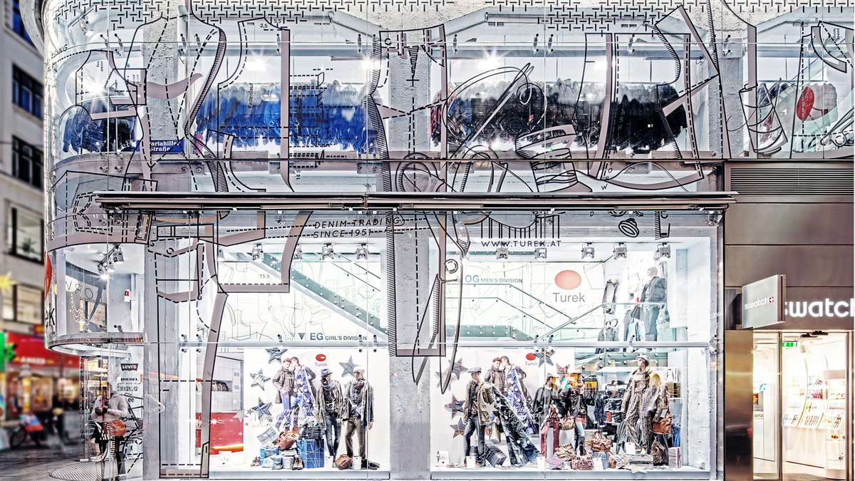
The red cash desk indicates customers the point of service. From the outside the huge store front made of glass is a signal all over the Mariahilfer Straße and gives an impression of identity and of the large dimension of the store.
Task
Redesign of the existing flagship store designed by BWM architects 10 years before.
Status
Completion
09/2004
Client
Herbert Turek
BWM Team
Erich Bernard, Charlotte Schülke, Judith Moser, Denis Kosutic, Robert Charuza
Image credit
BWM Architekten
Participants
HVAC
Angermaier Haustechnik
Statics
DI Gerhard Hejkrlik
Light design
XAL GmbH
Graphics
section.d - design communication gmbH
